Wedding Data Viz: How We Designed For Feelings
은상Silver정확한 비교보다 감정을 우선한 설계 결정을 논의하기에 좋은 사례입니다.A good case for discussing design choices that favor feeling over precise comparison.
Amy Cesal과 Zander Furnas가 자신들의 결혼식을 위해 만든 작업으로, 하객들 사이의 관계를 네트워크 그래프로 나타내고 하객마다 신랑 신부와의 관계를 담은 이름표를 디자인했습니다. 데이터 시각화 협업으로 만난 두 사람이 결혼식에 어떤 감정을 불러일으킬지를 주제로 삼았습니다.
Amy Cesal and Zander Furnas made this project for their own wedding, creating a network graph of how the guests were connected and individual badges showing each guest's relationship to the couple. The question was how data visualization could cultivate particular feelings at a wedding.
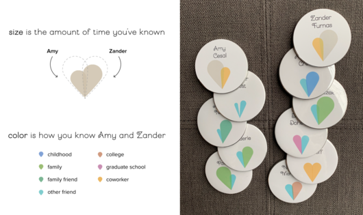
입구의 대형 배너에는 하객 관계망이 그려졌고, 지름 2.5인치의 이름표가 각 노드 역할을 하며 배너에 붙었습니다. 이름표의 하트는 두 사람 각각과의 관계를 로브로 나타내며, 크기는 관계의 길이, 색은 관계의 유형을 뜻합니다. 최근 관계도 따뜻하게 보이도록 최소 크기와 비선형 변환을 적용한 점은 정확성과 감정 사이의 설계 선택을 보여 줍니다.
A large banner at the entrance showed the guest network, and 2.5-inch badges doubled as the nodes and as labels, pinned onto the banner. Each badge's heart has lobes for the relationship to each of the couple, with size for length and color for type. A minimum lobe size and a non-linear transform keep newer relationships looking welcoming, a clear case of trading precision for feeling.
제작Credits
Amy Cesal - Viz; Zander Furnas - Data