The Emoji Biosphere
최종 후보Shortlist관찰된 격차에서 해결에 필요한 규모로 나아가는 명료한 2단계 비교 구성입니다.A clear two-step comparison that moves from the observed gap to the size of the fix.
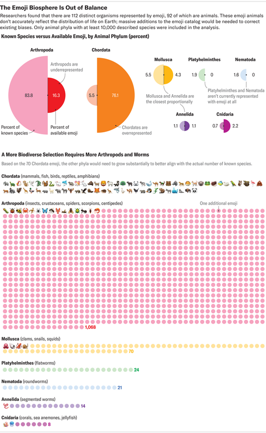
Scientific American이 2024년 1월 John Knight의 그래픽을 Lauren Leffer의 기사와 함께 온라인에 게재했습니다. 문(phylum)별로 사용할 수 있는 동물 이모지의 수를 실제 세계의 분포와 비교합니다. 이모지에서 과소 또는 과대 대표되는 문이 무엇인지를 묻습니다.
Scientific American published this graphic by John Knight in January 2024, alongside a story by Lauren Leffer. It compares the animal emojis available for each phylum with how animals are actually distributed in the real world. The question is which phyla are underrepresented or overrepresented in our emoji set.
먼저 문별 이모지 수를 실제 분포와 견주고, 이어서 과소 대표된 문이 균형을 이루려면 이모지가 몇 개나 더 필요한지 보여 줍니다. 온라인과 2024년 3월호 인쇄본에 모두 실렸기 때문에, 하나의 디자인이 화면과 지면을 모두 소화하는 예로 볼 수 있습니다.
The piece first sets emoji counts against real-world distributions by phylum, then shows how many more emojis the underrepresented phyla would need to reach balance. It ran online and in the March 2024 print issue, so it is a good example of one design serving both screen and page.
제작Credits
Graphic by John Knight; Graphics editing by Jen Christiansen and Amanda Montañez; Story by Lauren Leffer; Story edited by Sarah Lewin Fraser.